Brand resources
Everything you need to present ScalpBoard consistently and cleanly: logos, colors, fonts and the rules for using them.
Download brand assets SVG + PNG, zipNaming
ScalpBoard is one word with two capitals — S and B. In Russian it is written СкальпБорд, also one word with two capitals. Not “Scalpboard”, not “Scalp Board”, not “SCALPBOARD” in running text — all caps live only inside the logo itself.
Logomark
The letters P and D folded into a single shape. For tight spaces where the wordmark does not fit: avatars, favicons, tabs, small captions. Minimum size — 24 px.
Usage
Give the logo room to breathe: keep clear space of at least a quarter of its height on every side. Do not change the proportions, colors or layout.
Wordmark
Stacked
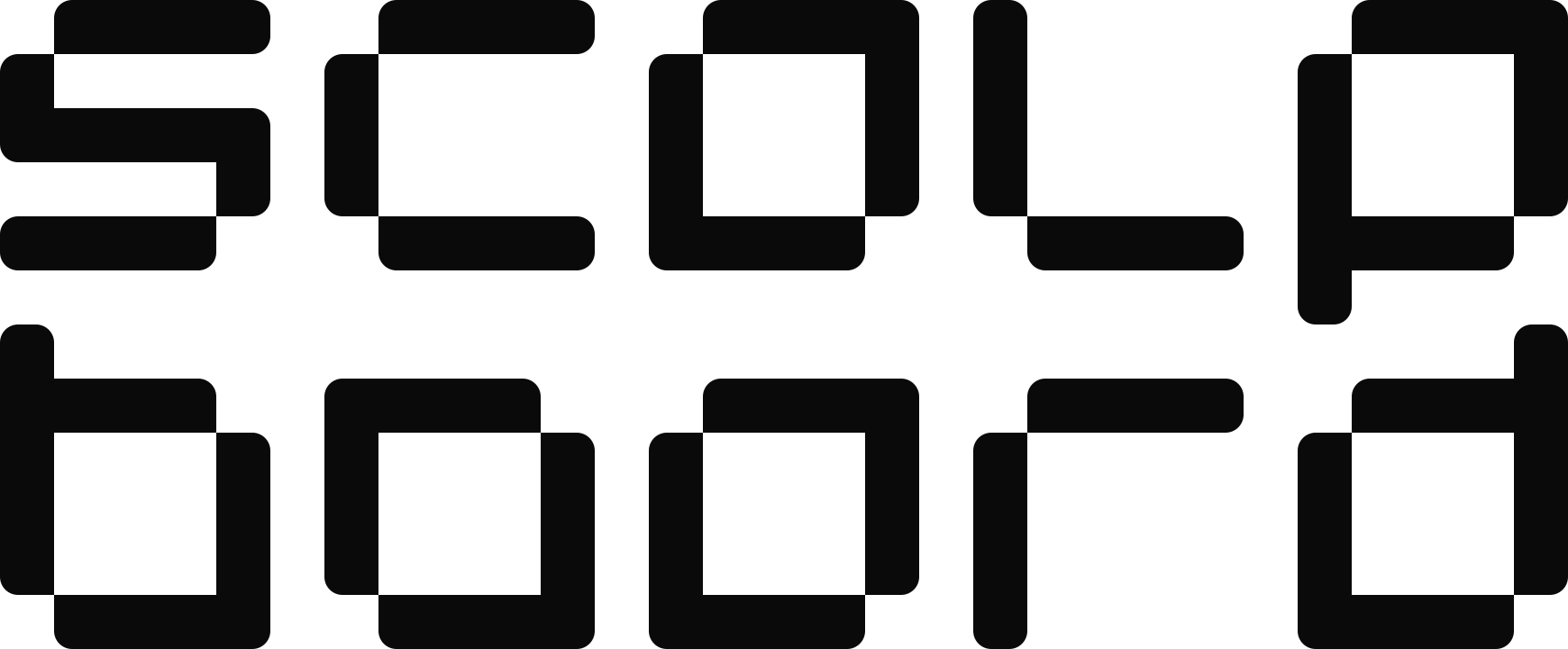
For vertical and square formats — covers, splash screens, merch. Always centered.
Icon







Colors
The brand lives in two colors — black and white. The rest are signal colors for the interface: up, down, attention. Never use them to fill the logo.
Typography
The interface and numbers are set in monospaced JetBrains Mono — with a slashed zero so 0 is never mistaken for O. Long-form text uses Noto Sans.